brand identity

Yoga Australia

YEAR 2020
PROJECT BRAND IDENTITY

The Challenge

As a professional organisation, and representative of yoga on a global scale, YA believed their brand was not currently representing their mission, values, and personality, and so Yoga Australia approached us to refresh their brand. 

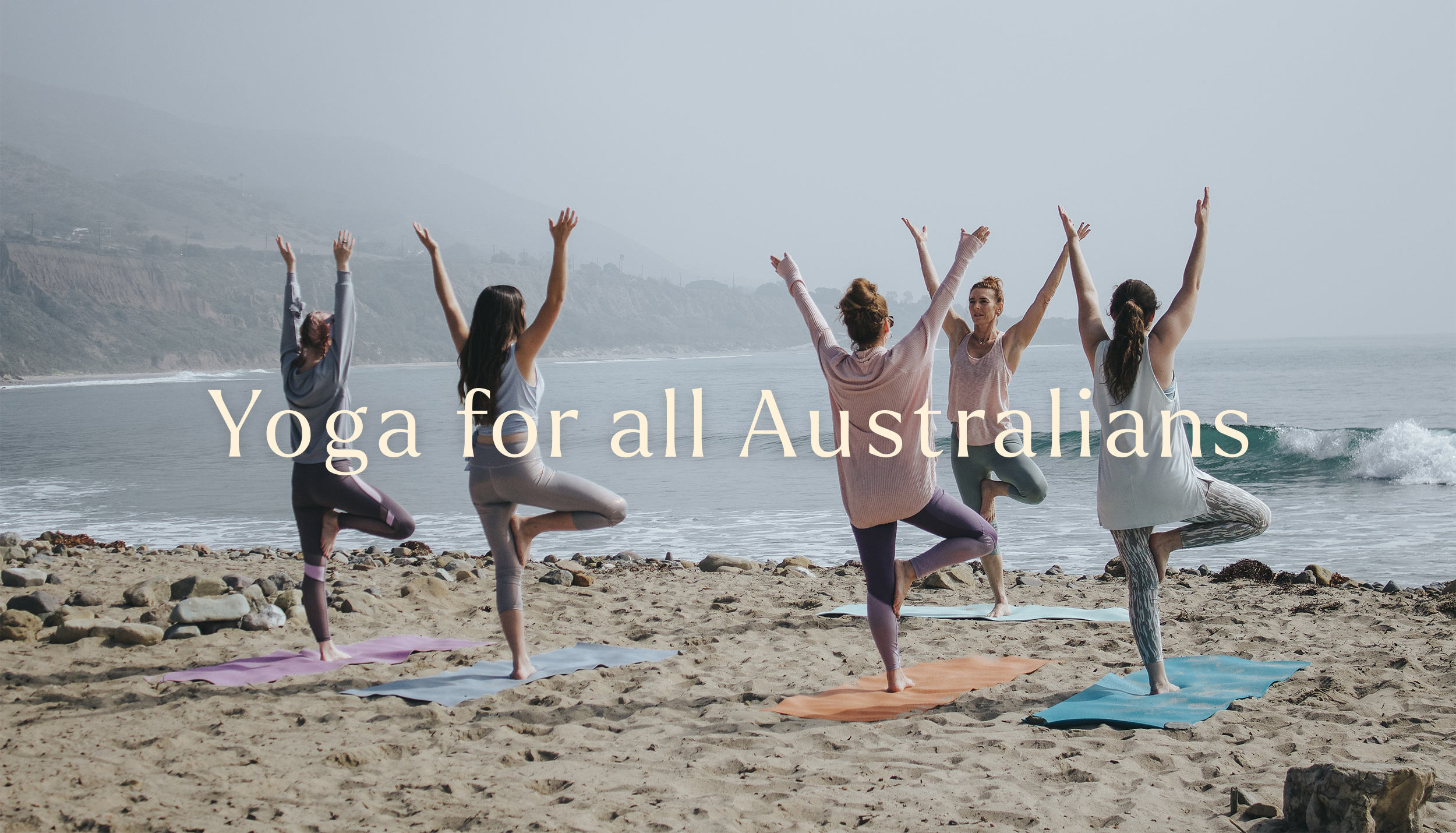
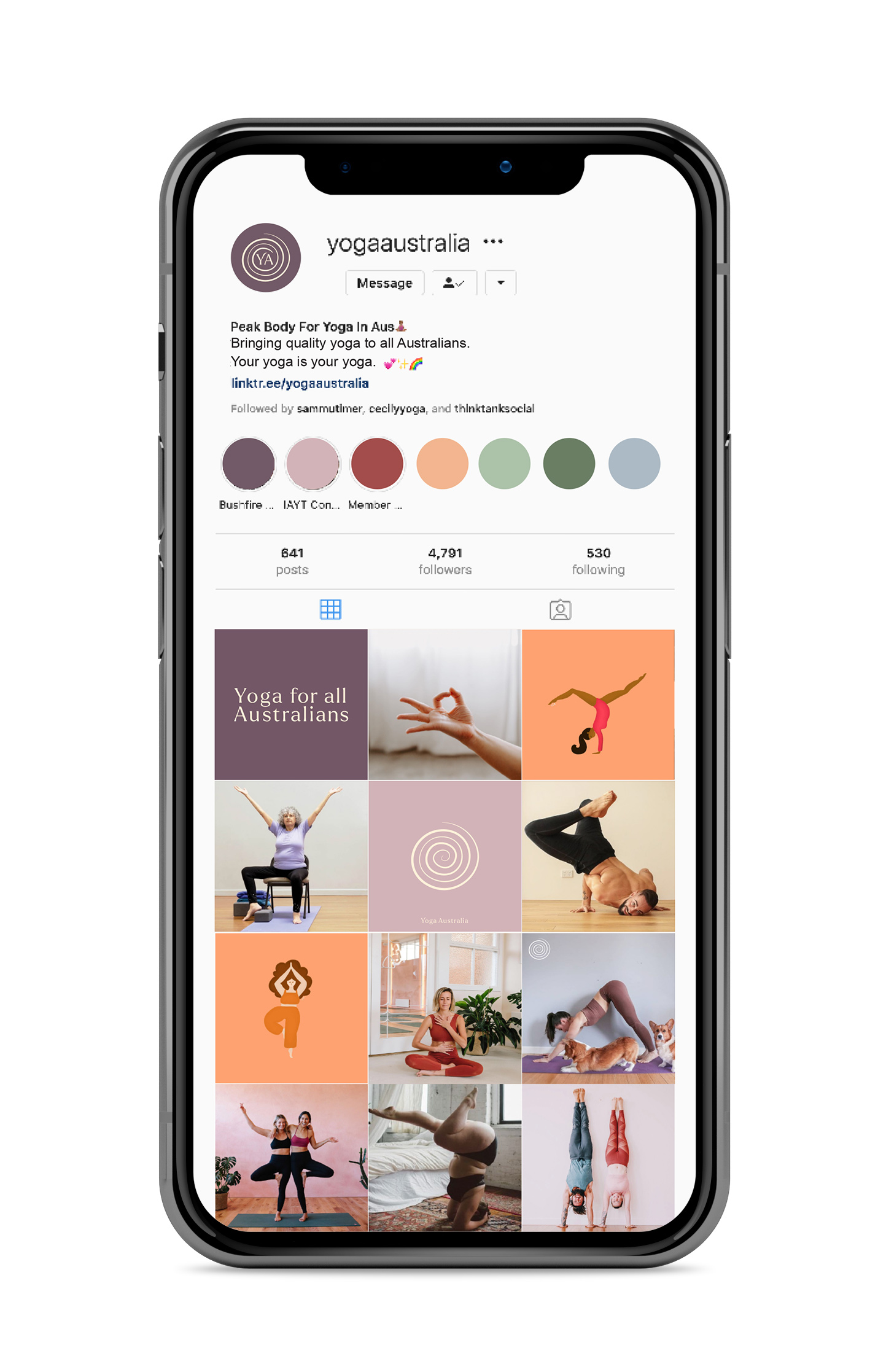
We were tasked with creating a bespoke brand identity that is modern yet timeless, just like that of Yoga, and one that is inclusive of all Australians and yogi’s alike. The goal of this brand refresh is to gain respect in the yoga community as the professional peak body, and provide quality yoga to all Australians. 

The Solution

Australians. We are a diverse bunch. We’ve come from every corner of the earth and called this place home, but what is something that we all recognise and something that can bring us together? Yoga. A practice and a place where you are unconditionally accepted for your uniqueness, and the only thing that truly matters is giving it a go.

To find a symbol that is the essence of Australia and recognised as a safe, accepting, growing, creative place - that was my task. As a country full of different walks of life, the symbol must be beyond language and race (just like yoga) to include anyone and everyone on their yoga journey,

Upon researching Indigenous Australian drawings, I found that the spiral, concentric circles with an open end, represented a ‘meeting place’ or ‘watering hole’. This ancient symbol has been used in almost every culture, from British, European and Scandinavian to Egyptian, Indian and Indigenous traditions, it is truly internationally recognised.

YA sml

So what does the spiral mean?

It is a great creative force, representing growth and expansion and is associated with the web of life. It represents the path from external materialism and egoism to internal awareness and authenticity. It symbolises the realms of existence, the various modalities of being and the wanderings of the soul in manifestation. 

“One of our most ancient and enduring symbols, it represents the winding journeys we must take inward if we’re to truly know and love ourselves. From these never-ending journeys, we return with infinitely more power and wisdom”

In the context of yoga, the spiral is the kundalini, which is symbolic of raising one’s consciousness on the path of the evolution of the soul. The spiral is connected to the flow of energy through the chakras as they spin in a circle.

Ultimately, the spiral represents the awareness of the self and the expansion of awareness outwards and is a highly recognised symbol of the spiritual journey across cultures.

Why it works

And so, the spiral was the solution to the new Yoga Australia.

Typographically speaking, the outreaching ‘arm’ of the Y eludes to the form of a yoga ‘body’, reaching in certain asanas (poses) in yoga. It also reaches the direction of the entrance to the spiral, showing the way to the inner journey of yoga.

The brand colours were specifically chosen to represent elements of Australia.
Greens = Eucalyptus, Orange & Red = Sun and our red earth, Blues = Water, Beige = Sand, and Mauve & Purple = Flower (being the core brand colours it shows a progression of the brand from its original colour way).

Agency:

TTS